Josef Albers · How do you know when one painting is better than another?
This in the art industry is called strength of image. It's a quotient to simply decide if one image is stronger, better, more desirable than another.
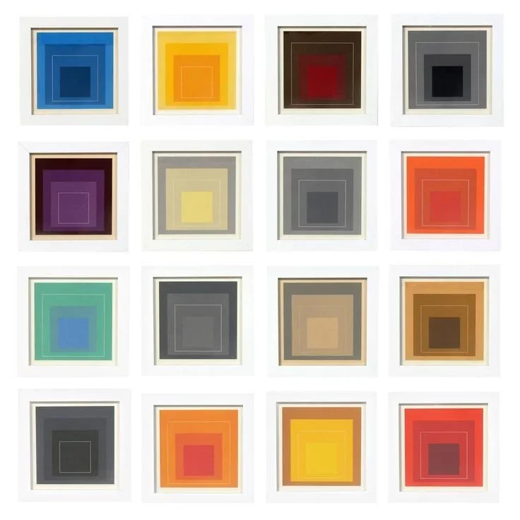
Let's have a look at two paintings. They're both by Josef Albers and both from the same series called “Homage to the Square.” “Homage to the Square” has about a thousand paintings in it. This series is his best series. But not all paintings are created equal.
Homage to the Square.
Josef Albers
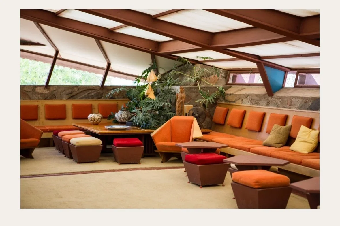
Painting number one is almost a monochromatic painting. It's really orange on orange on orange, which is super fascinating because it's very nuanced. The colors, which I love, are very periodized –meaning that this series was created in the mid-century– and, when you look at them, you feel that they are from this time, which is really interesting. If you think about Frank Lloyd Wright's Taliesin West, for example, you can see this kind of orange, that's used in there and other interiors and architecture. Really nice painting.
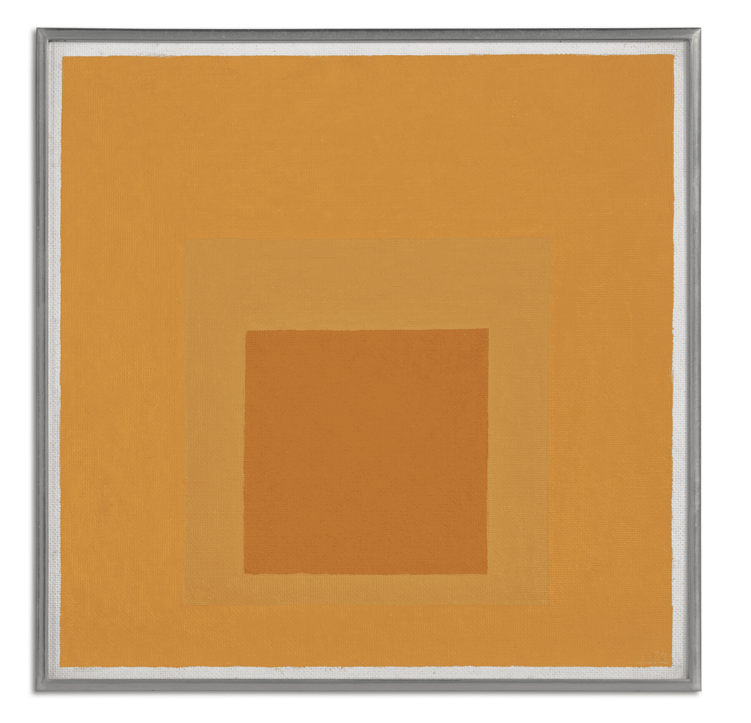
PAINTING Nº 1
Josef Albers
Homage to the Square, 1964
Oil on masonite
Frank Lloyd Wright
Taliesin West
Now let’s look at painting number two. First of all, is a four color “Homage to the Square.” The first one was three. More colors I think gives it a more dynamic feel. Also, the colors have a much greater contrast. You have this dynamic, really blue center that floats above two burgundy, concentric squares. If you looked at the two burgundy colors really fast, you would think that they were the same.
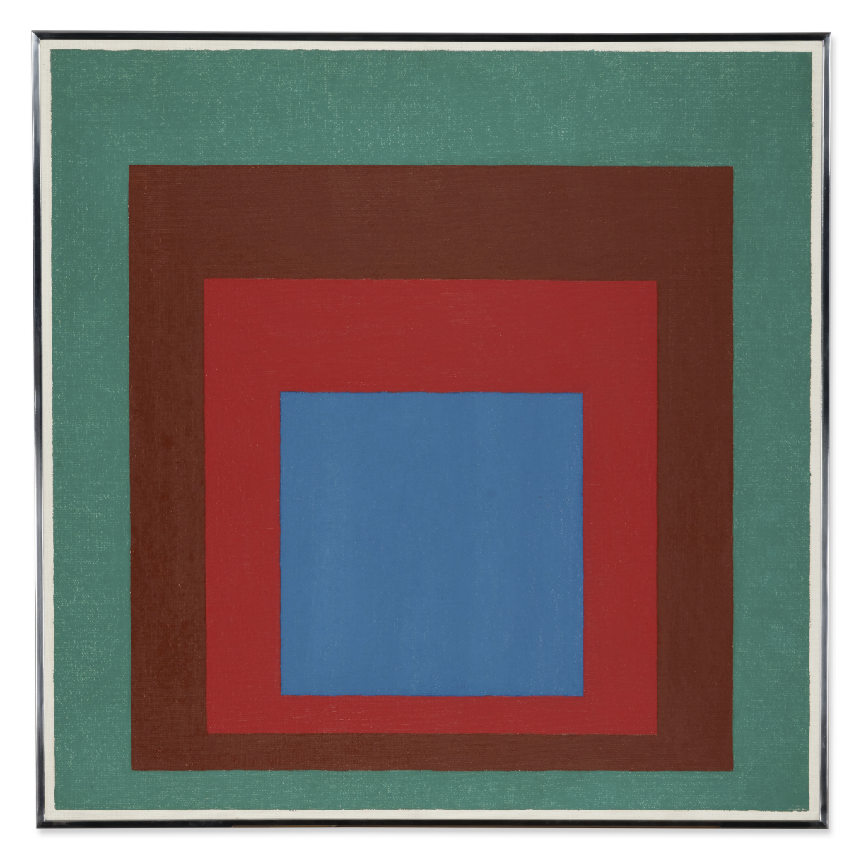
PAINTING Nº 2
Josef Albers
Homage to the Square: Protected Blue, 1957
Oil on masonite
But one on top of the other, you realize that they're very different. One of the things that you want to look at with strength of image is what was the artist's intent? Josef Albers thought about the colors that he would use in each one of these paintings almost like different characters in a play, different personalities. And you can see one of these burgundies has a much different feel personality-wise, than the other. You get something that's really dynamic in this interplay of color on color. The background color I love as well, kind of a deep turquoise. You might think of an expansive sea, that all these other colors float on top of.
Overall, you're getting a higher strength of image with painting number two, and if I were collection building, I would be definitely headed for this one. If you go through this process repeatedly from one decision to the next, you're going to wind up with a much better collection overall.